Enhancing computer vision applications with visualizations
Learn how to turn data from computer vision applications into easy-to-understand graphs using the Ultralytics Python package for better insights.
Every minute, huge amounts of data are being created, from airport terminals and train stations to shopping malls. As AI becomes more widely used, a lot of this data is now analyzed and broken down. But sometimes the results from these AI models can make it hard to spot patterns or understand trends at a glance. That’s where data visualization helps - it turns complex outputs into clear, easy-to-digest insights.
This is especially true when it comes to computer vision applications. Computer vision is a branch of artificial intelligence (AI) that helps machines interpret and understand visual information from the surrounding world, such as images and videos. While vision AI models, like Ultralytics YOLO11, can help analyze such visual data to gain information, data visualization helps put that information into a format that is easy to understand.
Simply put, data visualization bridges the gap between raw data and real understanding by using meaningful analytical graphs. In today’s data-driven world, this is key because it's not enough for machines to just perform tasks - we need them to tell a story.
That need for storytelling is exactly why data visualization is on the rise, with the market set up to reach $18.36 billion by 2030. Previously, we explored how computer vision can deliver valuable business insights. Today, we’ll take it a step further by walking through how to generate clear, insightful analytical graphs for computer vision applications using the Ultralytics package. Let’s get started!
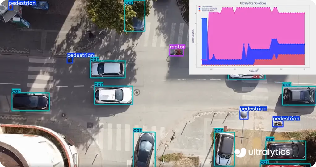
Fig 1. An example of visualizing data based on outputs from YOLO11.
Link to this sectionAn overview of data visualization in computer vision applications#
Data visualization in computer vision applications involves transforming the results of computer vision tasks, such as object detection and tracking, into easy-to-understand charts or dashboards. These visuals help identify patterns and trends, especially when working with large volumes of video footage.
For instance, instead of manually reviewing hours of surveillance video, a simple line graph showcasing the number of cars or people detected over time can quickly highlight peak hours or unusually quiet periods.
Here are some key reasons why data visualization is useful:
-
Simplifies complex data: Thousands of object detections can be overwhelming, but visualizations like bar or pie charts make it easier to see the big picture, for instance, which objects appear most frequently.
-
Reveals trends: Line and bar graphs help identify patterns over time, such as when and where foot traffic tends to increase.
-
Saves time: Instead of reviewing every frame of video, charts can quickly highlight important details, like sudden spikes in vehicle activity or unusual object appearances in restricted zones.
-
Improves communication: Visuals make it easier to share insights with non-technical audiences, helping everyone understand the results more clearly.
Link to this sectionDifferent types of data visualizations#
Different types of analytical graphs can turn computer vision results into clear, easy-to-understand visuals. Let’s say you’re working on a computer vision application that detects people and vehicles in surveillance footage. In this case, a line graph is great for showing how the number of detections changes over time, like tracking peaks in foot traffic throughout the day.
Similarly, bar charts are helpful when you want to compare the number of different object types detected, like seeing whether more cars, bikes, or pedestrians appear in the video. Pie charts, on the other hand, show what percentage each object type makes up of the total detections. Each graph has its own use and helps make complex computer vision data easier to interpret and share.
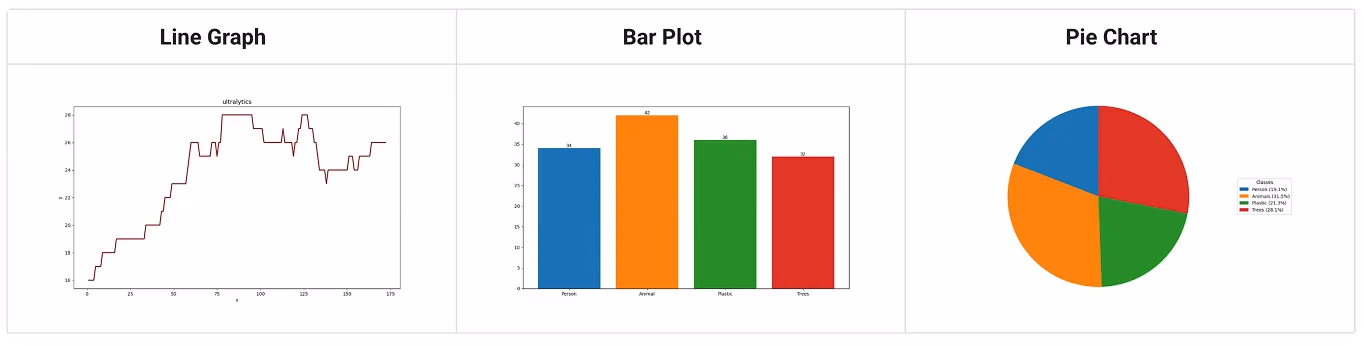
Fig 2. Examples of analytical graphs.
Link to this sectionGenerating analytical graphs to get computer vision insights#
Now that we’ve explored what data visualization is and why different types of analytical graphs matter, let’s take a closer look at how to use the Ultralytics Analytics solution to visualize the results of your computer vision model predictions. Before we walk through the step-by-step process, let’s take a look at the tools and setup options for training and using the Ultralytics package and models like YOLO11.
The Ultralytics Python package makes it easy to train models, detect objects, run predictions, and visualize results. To get started with it, you’ll need a coding environment. Here are three simple options:
-
Command-Line Interface (CLI): It is a basic, text-only tool where you can type commands to run your code. It doesn’t have a visual interface, and you interact with it by typing instructions into a terminal or command prompt.
-
Jupyter Notebooks: It is an interactive coding environment where you can write, run, and test small chunks of code (called "cells") one at a time. It shows results directly below each cell, making it easy to understand what's happening step by step. It's especially useful for learning and experimentation.
-
Google Colab: This option is a free, cloud-based version of Jupyter Notebooks that runs in your web browser. It doesn’t require any setup on your computer and gives you access to free GPUs for faster processing.
These tools are great for getting started quickly, but users can also integrate Ultralytics into Integrated Development Environments (IDEs) like Visual Studio Code (VS Code) or into production pipelines. For more options, explore the official Ultralytics documentation.
Link to this sectionStep 1: Setting up the environment#
Once you’ve chosen your preferred environment, the next step is to set it up for running predictions and visualizing the results. You can use any of the environments mentioned above, depending on what you're most comfortable with.
If you're working in Google Colab, keep in mind that it uses a CPU by default, which can slow down performance. To speed things up, switch to a GPU by going to the "Runtime" menu, selecting "Change runtime type," and setting the hardware accelerator to GPU (ideally a T4).
To get your environment ready, you’ll need to install the Ultralytics Python package using the command mentioned below. In notebook-based tools like Colab or Jupyter, be sure to add an exclamation mark (!) before the command.
pip install ultralyticsLink to this sectionStep 2: Downloading a video file#
Next, we’ll need a video to work with. You can easily download one from a free stock site like Pexels. Make sure to choose a video that includes objects YOLO11 can detect. Since the model is pretrained on the COCO dataset, it can recognize common objects such as people, cars, and bicycles.
For this tutorial, we’ll use a video of baggage handling in a busy airport terminal. You can use the same video or choose a different one that fits your project.

Fig 3. A frame from the input video showing baggage handling in an airport terminal.
Link to this sectionStep 3: Importing packages#
Next, we can import the necessary libraries and load the input video.
We’ll start by importing OpenCV (cv2), which is a widely used library for working with images and video in computer vision. We'll also import the Ultralytics library, which helps us run object detection and generate analytics from the video.
Then, we’ll try to open the video file by specifying its path. Make sure to replace "path/to/video.mp4" with the actual location of your downloaded video file.
Also, the code snippet below includes a simple check to make sure the video loads correctly. If the path is wrong or the file is corrupted, the program will stop and show an error message: "Error reading video file."
import cv2
from ultralytics import solutions

cap = cv2.VideoCapture("path/to/video.mp4")
assert cap.isOpened(), "Error reading video file"
Link to this sectionStep 4: Preparing the video writer#
Then, we’ll set up a video writer to save the output. When we run the analytics, this part of the code will create a new video file that records the updated graphs generated from each frame of the original video.
In the code snippet below, we first extract key properties from the input video - its width, height, and frames per second (fps). These values are taken directly from the video and converted to integers to ensure they’re in the correct format for writing the output.
Next, we use the cv2.VideoWriter function to create a new video file, named "analytics_output.avi" (you can rename it as needed). The video is saved using the MJPG format, which is a common video compression method. The output resolution is set to 1280×720 pixels, regardless of the original video's size.
w, h, fps = (int(cap.get(x)) for x in (cv2.CAP_PROP_FRAME_WIDTH, cv2.CAP_PROP_FRAME_HEIGHT, cv2.CAP_PROP_FPS))
out = cv2.VideoWriter(
    "analytics_output.avi",
    cv2.VideoWriter_fourcc(*"MJPG"),
    fps,
    (1280, 720),
)
Link to this sectionStep 5: Setting up the Ultralytics Analytics solution#
Now, we’ll set up the Ultralytics Analytics solution to generate graphs from the video. You can choose how the data is displayed, such as a line, pie, area, or bar chart, and which YOLO model to use. In this example, we’ll use the lightweight "yolo11n.pt" model and show the results as an area graph.
analytics = solutions.Analytics(
    show=True,
    analytics_type="area",
    model="yolo11n.pt",
)
Link to this sectionStep 6: Processing the input video#
The final part of the code runs a loop that processes the video one frame at a time. Each frame is passed to the analytics tool, which updates the graph in real time. The updated graph is then written to the output video. If a frame can’t be read, the loop stops. After all frames are processed, the video is saved and any open windows are closed.
frame_count = 0
while cap.isOpened():
    success, im0 = cap.read()
    if success:
        frame_count += 1
        results = analytics(im0, frame_count)
        out.write(results.plot_im)
    else:
        break

cap.release()
out.release()
cv2.destroyAllWindows()
Link to this sectionStep 7: Putting it all together#
Finally, let’s put everything together. With just a few extra lines of code, we can generate two output videos: one showing the YOLO11 object detection results with bounding boxes and labels, and another showing the real-time analytics graphs.
To do this, we’ll set up two VideoWriter instances - one for saving the prediction video and another for the analytics. This version of the code includes both object tracking and graph generation, so you can see detection results alongside the visual insights.
Here is the comprehensive code along with examples of both the prediction and analytics outputs.
import cv2
from ultralytics import YOLO, solutions

# Load model and video
model = YOLO('yolo11n.pt')
cap = cv2.VideoCapture('path/to/video.mp4')
assert cap.isOpened(), "Error opening video"

# Get properties
w, h = int(cap.get(3)), int(cap.get(4))
fps = cap.get(5)
analytics_res = (1280, 720)

# Writers for prediction and analytics videos
out_pred = cv2.VideoWriter('output_predictions.avi', cv2.VideoWriter_fourcc(*'MJPG'), fps, (w, h))
out_ana = cv2.VideoWriter('output_analytics.avi', cv2.VideoWriter_fourcc(*'MJPG'), fps, analytics_res)

# Analytics setup
analytics = solutions.Analytics(show=True, analytics_type="area", model='yolo11n.pt')

# Process frames
frame_count = 0
while cap.isOpened():
    ret, frame = cap.read()
    if not ret:
        break
    frame_count += 1
    pred_frame = model.track(frame, persist=True)[0].plot()
    out_pred.write(pred_frame)
    resized = cv2.resize(pred_frame, analytics_res)
    out_ana.write(analytics(resized, frame_count).plot_im)

cap.release(), out_pred.release(), out_ana.release(), cv2.destroyAllWindows()
When the code above runs successfully, it will generate two output videos. The file “output_predictions.avi” will show the object detection results with bounding boxes and labels, while “output_analytics.avi” will display the real-time analytics graphs based on the detections.
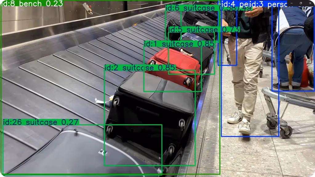
Fig 4. A frame from the “output_predictions.avi” file.
Here is a frame from the analytics output based on the predictions. Using the area chart, we can gain insights like fluctuations in suitcase counts over time, such as a spike around frame 268, indicating suitcase movement or activity in that part of the video.
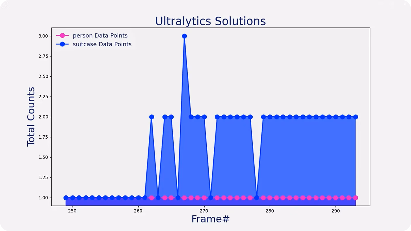
Fig 5. YOLO11 predictions visualized as an area graph.
Link to this sectionUsing graphs in real-world computer vision applications#
Here are some real-world computer vision applications where data visualization has a meaningful impact:
-
Healthcare: Computer vision systems can monitor patient activity, staff movement, and equipment usage in real time. This generates large amounts of visual data that, when visualized, can reveal patterns - such as peak patient occupancy times or response delays.
-
Retail and e-commerce: Vision AI can be used to track customer movement, dwell time in front of shelves, and product interactions. Visual analytics like bar or pie charts can highlight which store zones or items receive the most attention, helping retailers optimize product placement and improve conversions.
-
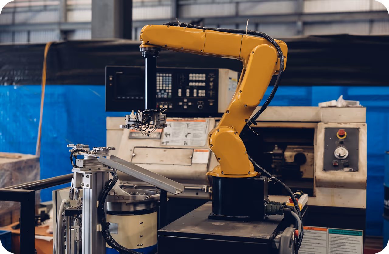
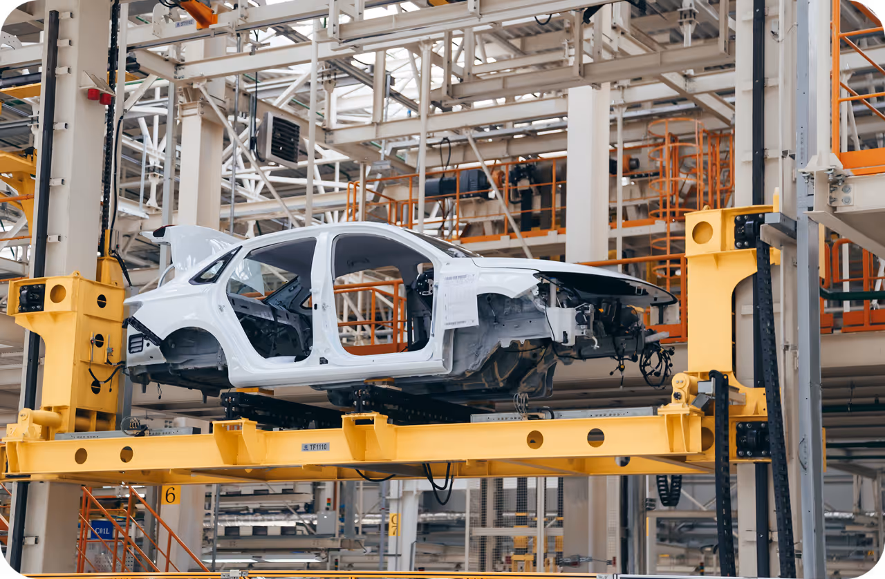
Manufacturing: Cameras equipped with computer vision models can monitor assembly lines for defects, safety violations, or equipment status. Data visualization can show trends in the most common defect types or highlight time periods with the highest error rates, enabling faster decision-making and preventive maintenance.
Link to this sectionKey takeaways#
With the Ultralytics package, you can easily turn video footage into clear, insightful graphs that reveal what’s happening, such as tracking how many people or objects appear over time. Instead of manually reviewing hours of video, you can generate visual summaries that highlight key patterns and trends, making it easier to act quickly. Whether it's in hospitals, retail stores, or manufacturing facilities, these graphs turn complex AI outputs into insights that anyone can understand and use.
Want to learn more about AI? Explore our GitHub repository, connect with our community, and check out our licensing options to jumpstart your computer vision project. Find out more about innovations like AI in manufacturing and computer vision in the logistics industry on our solutions pages.