Data Visualization
Explore the power of data visualization in AI. Learn to interpret complex datasets, track training, and visualize Ultralytics YOLO26 results with ease.
Data visualization is the graphical representation of information and data, serving as a critical translation layer that converts complex numerical datasets into accessible visual contexts like charts, graphs, and maps. In the specialized fields of Artificial Intelligence (AI) and Machine Learning (ML), this practice is indispensable for interpreting the vast arrays of tensors and probabilities that models generate. By leveraging tools such as the Ultralytics Platform, engineers can visualize dataset annotations and training progress, making it easier to identify trends, outliers, and patterns that would remain hidden in raw spreadsheets. Effective visualization fosters transparency, allowing developers to debug systems and stakeholders to trust automated decision-making processes.
Link to this sectionThe Role of Visualization in Computer Vision#
For Computer Vision (CV) workflows, visualization is applied at every stage of the model lifecycle, from initial data gathering to final deployment.
- Exploratory Data Analysis (EDA): Before training, practitioners use visualization to understand their inputs. Libraries like Matplotlib and Seaborn help plot class distributions to detect dataset bias. Analyzing these distributions ensures that the training data represents the real-world environment accurately.
- Training Dynamics: During the learning process, engineers monitor performance by plotting the loss function and accuracy over time. Tools like TensorBoard or Weights & Biases allow users to track these metrics in real-time, helping to spot issues like overfitting or vanishing gradients early in the process.
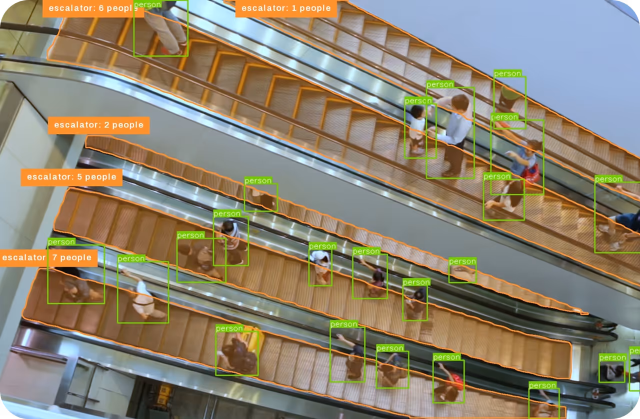
- Inference Results: The most direct application involves overlaying model predictions onto images. This includes drawing bounding boxes for detection tasks, painting pixel-wise masks for image segmentation, or plotting keypoints for pose estimation.
Link to this sectionReal-World Applications#
Visualization bridges the gap between technical metrics and business value in various industries.
-
Healthcare Diagnostics: In AI in Healthcare, visualization is used to highlight abnormalities in medical imaging. For instance, a model processing MRI scans might use segmentation overlays to color-code tumor regions. This visual aid assists radiologists in making faster, more accurate diagnoses, serving as a core component of Explainable AI (XAI).
-
Retail Analytics: For AI in Retail, store managers utilize heatmaps generated from surveillance feeds. These visualizations aggregate customer movement patterns over time, revealing "hot spots" where high foot traffic occurs. This data informs store layout optimization and product placement strategies without requiring the user to parse raw coordinate logs.
Link to this sectionDistinguishing Related Terms#
- Data Analytics: This is the broader science of analyzing raw data to make conclusions. Visualization is a technique used within analytics to present findings. You can read more about this distinction in Tableau's guide to analytics.
- Data Mining: Data mining focuses on the algorithmic discovery of patterns and correlations within large datasets. While mining extracts the insights, visualization provides the graphical interface to view them.
- Dashboarding: A dashboard is a collection of multiple visualizations organized on a single screen to provide a comprehensive overview of system health or business KPIs, often used in business intelligence tools like Microsoft Power BI.
Link to this sectionImplementing Visualization with Ultralytics#
The Ultralytics API simplifies the visualization of inference results. The following example demonstrates how to load a YOLO26 model and display the detected objects with their labels and confidence scores directly on the image.
from ultralytics import YOLO

# Load the latest YOLO26 model (recommended for new projects)
model = YOLO("yolo26n.pt")

# Run inference on an image source
results = model("https://ultralytics.com/images/bus.jpg")

# Visualize the results
for result in results:
    # plot() returns a BGR numpy array of the annotated image
    im_array = result.plot()
    # show() displays the image directly using the default image viewer
    result.show()
This code snippet automatically handles the drawing of boxes and labels, allowing developers to immediately verify the model's capabilities on object detection tasks.